A/B testing (AKA split testing) compares two versions of a landing page or marketing asset and measures the difference in performance.
Basically, it’s a competition. You’re letting two elements battle it out for the top spot. You never test more than one variable at once, otherwise it’s impossible to distinguish what’s driving the results.
Knowing which variation works better can help inform future decisions when improving your website copy, email content, or any other aspect of your digital marketing strategy.
It’s an essential practice if you want to increase sales and sign-ups. Led by the data, you’ll be able to craft better campaigns and drive more conversions over time. Here are twenty different tests that you could run to try improve your conversion rates across your ads, emails, or on your website.
Facebook A/B tests
-
Automatic vs edited placements
Facebook Ads Manager sets all campaigns to ‘automatic placements’ by default. Try running 2 identical campaigns but edit the placements on one of them.
Many marketers would argue that the newsfeed is the best placement for driving conversions. This is a good placement test to begin with in comparison to automatic placements.
If you’re not testing your Facebook audiences, you’re missing out on some juicy conversions.
Narrowing down audiences that give you a great return on investment takes plenty of experimentation and tweaking, but it’s totally worth it.
Try A/B testing different interests, demographics, and custom audiences to get a clear picture of your best converters.
One of the best features of Facebook ads is its creative formatting options. But how do you know what works best for each campaign?
Keep everything the same except your creative style. A/B test carousel, image, and video ads options to draw helpful, data-based conclusions about performance.
You’ll see a mix of long and short headlines on Facebook ads. That’s because the best length really depends on each campaign and audience.
Pit multiple headlines against each other to consistently improve your conversion rate. There’s plenty of tests to choose from like: long vs short, emojis vs no emojis, the wording of your offer (½ price vs 50% off), etc.
This generation has been mocked for their short attention spans, but that doesn’t mean
only short videos produce conversions.
Maybe your audience will enjoy a richer, more informative video or perhaps short and sweet is the way to go. Test, and you shall know for sure.
Google Ads A/B tests
It might be tempting to use up all the space for your Google Ads headlines. The reality is, some campaigns might perform better if you make them more concise.
As long as you’re only changing one element at a time, you can test anything: adding your brand name, different CTAs, benefit vs feature-based language, and much more.
-
Automated vs manual bidding strategy
Do you tend to stick with the same bidding strategy for every campaign? It’s good practice to compare a few bidding strategies frequently, as each strategy can produce dramatically different results.
You could try one campaign using target CPA and another with manual bidding, for example. Give the test enough time to find a winner, and you’re on your way to getting more sign-ups and sales for less!
-
Dynamic vs non-dynamic text
Your campaign may benefit from the use of dynamic text. This is when Google pulls in a combination of headline and description text based on the user’s intent.
It can increase the relevance of your ads, therefore increasing the chance your audience will convert. The important thing is that you’ll know for sure once you give it a go, rather than relying on your gut feeling.
-
Two landing page versions
Where your audience lands after seeing your ad is incredibly important. Can changing one element on each landing page really create more sign-ups or conversions?
Give yourself more data to work with by testing this out and seeing how your visitors react. Something as simple as adding a product demo video or button colour might resonate better with your visitors.
-
Different targeting options
When you know what specific audiences are giving you more clicks, sales, and sign-ups, you can concentrate your efforts on the right people. Without adequate testing, you’re pretty much going in blind.
For example, if you’re selling an
808 bass plugin, maybe 18-24 year olds are more interested in the product than 40-60 year olds?
Based on the results, you can give more budget to the best-performing audience and exclude groups that aren’t worth your while.
Email A/B tests
The headline is the most important part of your entire email marketing campaign and if you get it right, you can dramatically increase your open rates.
Asking a question or piquing the customers interest with an unusual headline can increase open rates (though its effectiveness may reduce in the long term). For example:
“
Can you have enough piano sample libraries?” (instead of something more mundane like “
We released the black grand piano“)
or
“
Is this the weirdest sound design plugin we’ve ever created?” (instead of “The Morph plugin is now available at $99”)
Every customer base is different so you need to balance your email headline with what your customers expect from your brand – ie. don’t be too serious if your brand is fun and don’t be too whacky if your brand is professional.
This sounds counter intuitive right? But it actually works…most of the time…
This is an unusual split test to run and can have varying results. Some customers get annoyed if you don’t include the price in your email, but at the same time, your click through rates (and thus overall sales) will increase as people will have to click through to your website to see the price. This generally works best when running a sale – the customer can see its 70% off in your email, but needs to click on the “More Info” or “Buy Now” button in the email to see the final price.
Again, it can upset some customers so you’ll need to see if it works best for you.
You might not think so, but there’s a massive difference between ‘
Subscribe’ and ‘
Sign me up’ CTAs.
Maybe your audience likes the first button more because it’s succinct and professional. Perhaps they’ll enjoy the more personal approach of the second CTA. These subtle changes could be the difference between 20 and 50 subscribers.
Consider testing sending your emails at different times of the day or week. With most major email platforms, you can split test this automatically – try allowing your email platform to automatically send at the best time (this is generally based customer timezones) vs when you think would be best.
Alternatively try sending emails on a Monday vs Friday or Wednesday vs Weekend – you might be suprised with the results.
According to a study by
Campaign Monitor, click-through rates increased by 14% in emails using personalisation. It’s not a one-size-fits-all strategy, however, and can actually deter a portion of your audience.
Try it out for yourself today by adding your recipient’s name into either the subject line or the body text and see if this boosts your open rate.
Website A/B tests
Does CTA placement really matter? The answer is absolutely. It needs to stand out in all the right places.
Should you put it above the fold, below it, at the end? All of the above? This truly depends on your own website.
Try testing the same landing page but with the CTA above or below the fold and continue with other variations until you have the winner.
Your website’s banner image is the first thing your visitors see so you better make it count. Many business owners stick with the same website banners for years, maybe it’s time you tried something new?
Psychologically, everything from the colours to the size of your banner image can affect how users engage with your website.
You could try the same image but with a different background colour, or demographic of people for example. Get creative and reap the rewards of your thorough investigation. Use
Canva if you don’t want to spend money on a designer.
See these
20 conversion-boosting hero image examples for inspiration.
There are multiple approaches you can take when it comes to A/B testing copy. One of the simplest tests to run is to show one version with succinct copy that gets right to the point and another with more informative text.
Here’s where you can determine what people like and apply the same theory to your other pages. You can also test the tone, headlines, and product descriptions for a more conversion-driven experience.
Sometimes its easiest to sell in your own currency only, but depending on when your customers are located, you might be losing out on potential sales if they don’t see the price in their own currency. For example, maybe you sell in GBP but the majority of your customers are actually in the US so you should actually price in USD?
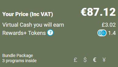
The best option is to offer multiple currency options (see example by Plugin Boutique below) but if that’s not possible, its a good idea to test with different currencies to see if one resonates best with your customers.
Alternatively, take a look at your Google Analytics information to see where the majority of your customers are located and make a decision from there.
If you’ve installed a pop-up form on your website, evaluate the best display trigger and time for your audience. Too early and it might annoy users, too late and they might miss it.
You can also test multiple texts, images, form fields, and incentives to decide the best route to take. If you’re looking for more sign-ups, testing the form is crucial, so don’t leave it out of your testing strategy.
Additionally, try only placing popup forms on specific pages rather than your entire website – like your freebie page only or just on your blog?
Want better results? Start testing!
As you can see from the above examples, there are plenty of split tests you can be running at all times to make incremental improvements in your metrics. The simplest ones to start with are email and Facebook/Google ads.
You’re looking to level up your sales and marketing – why not level up your customer support too?
The Pulse downloader app streamlines your product download and installation process for customers which in turn reduces the time you have to spend on customer support – allowing you to spend more time on the things that matter like creating new products and sales/marketing.
See our pricing information here.